rAmfu
September 16, 2026, 9:37pm
1
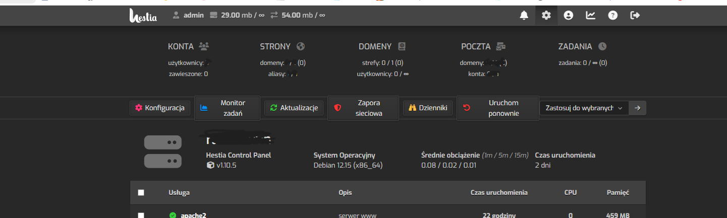
Hi, i’m using a polish language and after last update my admin panel look wired O.o
Is this due to changes in style, or is it something on my end?
My hestiaCP:
System debian 12 updated yesterday.
This situation only occurs in the main panel, it doesn’t happen anywhere else.
sahsanu
September 16, 2026, 9:57pm
2
I suppose it’s related to this change:
main ← eduardomozart:fix/backup-restore-button
merged 12:44PM - 05 Sep 26 UTC
## Description
This PR fixes a visual bug on mobile devices where the icons ins… ide table action buttons (e.g., Visit, Edit Domain, Suspend, Restore) were overlapping the first letter of the button text.
<img width="500" height="667" alt="SCR-20260902-midu" src="https://github.com/user-attachments/assets/02f935ec-c4c9-4149-b444-02f23165f1f4" />
The issue was caused by `padding` being used for horizontal spacing on the `.fas` icon elements. Because of `box-sizing: border-box` and FontAwesome's inherent glyph widths, the horizontal padding squished the icon's content box, forcing the glyph to physically overflow its container to the right and cover the adjacent `<span>` text.
## Changes Made
- **`web/css/src/themes/default.css`**: Migrated horizontal spacing on `.units-table-row-action .fas` from `padding` to `margin` for mobile viewports. This properly separates the icon from the text without triggering content box overflow.
- Ensured that `margin: 0` is reset on desktop viewports (`--viewport-large`), preserving the intended square button layout.
- Ran `npm run build` to successfully recompile the minified CSS assets (`web/css/themes/default.css` and `dark.css`).
## How to Test
1. Access the control panel from a mobile device (or simulate mobile view via browser DevTools).
2. Navigate to the **Web**, **Backups**, or any other page with table action buttons.
3. Verify that the text inside the action buttons (e.g., "Edit Domain", "Restore") is properly spaced and no longer sits underneath the icons.
<img width="502" height="676" alt="SCR-20260902-mizk" src="https://github.com/user-attachments/assets/76f4d9b4-8a67-46ad-b463-6563b7ff7551" />
It seems that because the change added more margin, and there is more text in the buttons in Polish, there isn’t enough space on the line, which is why the buttons look odd.
sahsanu
September 16, 2026, 10:14pm
3
Use this command to fix it temporarily:
sed -i.bak 's/;margin-bottom:5px;padding-left:10px;padding-right:10px}.toolbar-buttons/;margin-bottom:5px;padding-left:5px;padding-right:10px}.toolbar-buttons/g' /usr/local/hestia/web/css/themes/default.min.css